
Creating better
reading experiences
How to ensure a great reading experience on the smartphone?
Concept, design and front end of an enhanced mobile e-book.
| Assignment | Bachelor thesis and additional project |
| Team | 1 person |
| Time | 6 months |
| Tags | User experience design, web design, lean startup |
The Challenge
As technology continuously advances, new possibilities arise in which a story can be told. Nevertheless most reading apps still imitate books instead of using the opportunities for multimedia stories. So the idea behind this project is to develop a concept and checkout the technical possibilities to enhance the reading experience of novels on smartphones, ending with a potential minimum viable product.
Approach
This project has been divided into two different assignments. The first one for the bachelor thesis contains the research, concept and design of the reading app. As guidance through the design process, I oriented myself on Garrett’s “The elements of user experience” and ended with testing the high-fidelity prototype. The second part continues with the development of a front end, focussing on the performance of the content, as that is the main reason for using the website. I finished the assignment with user centred performance tests of three different variants.
Overview

Research: Delving deep into the topic
User interviews
To get started I began with some user interviews. My main goal was to find out what, why, when, and where people read on their smartphone, what they liked about it and what held no appeal to them. The results gave me a first impression of the context of reading and the usage of the smartphone.

Surveys & Literature
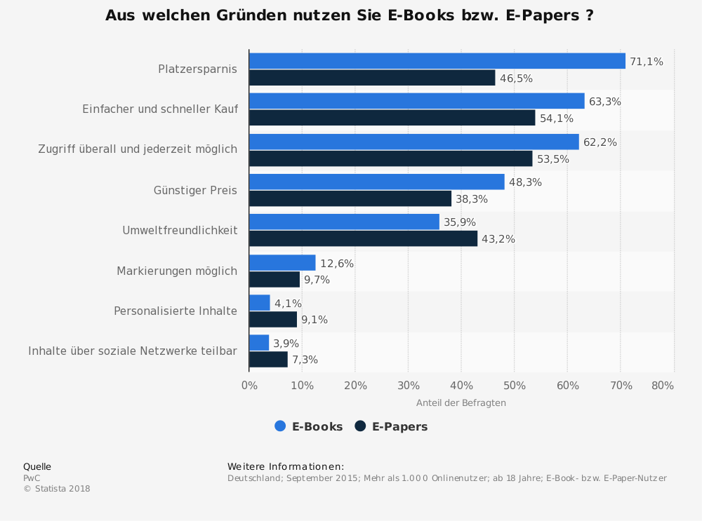
To confirm my findings I checked literature and surveys for more information. They validated and expanded the data from the interviews. I found out that 43% of German eBooks readers are between 14-29 years old and that 80% of them like to read eBooks, because it fulfils their wish to read “anywhere”, “anytime”, and “anything”.
Furthermore, I looked at the psychology of reading, finding that entertainment and availability play an important part in continuous reading. While reading a story, imagination creates inner pictures and emotions that stimulate the reader. Especially tension and excitement are favoured, considering the popularity of thrillers. Particularly interesting was one study in which some readers wished for visual aid in some scenes, because they had trouble imagining them. They also preferred reading, because they were able to experience the story in their own speed and could skip to their favourite parts.
Product research
To conclude my research, I looked at the available products and concepts on the market. My goal was to search for norms, metaphors, and operating philosophies which have already been established as well as different concepts of presenting a textual and visual story. The results strongly influenced the list of function specifications.
Concept: Building the foundation
Persona
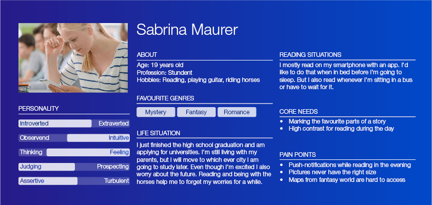
Defining the user group to female readers between the age of 18 and 25 helped to create personas in the next step. With the researched information in mind, the personas made the upcoming process and design decisions easier. They also helped to look for test subjects later on.

User scenarios & feature prioritization
A few short scenarios for Sabrina reflected the already collected contexts for reading and gave strong ideas what functions are required. In combination with the researched data I listed functional specifications and content requirements. Then I prioritized and categorized them in “must”, “should”, and “could”, making it clear where to start and getting an overview.

Sitemap & interaction
Bringing everything together and creating the first visual structure resulted in a sitemap. As the idea of the reading app contained just one main story, the structure is relatively flat so I decided to include the interactions as well.

Wireframes
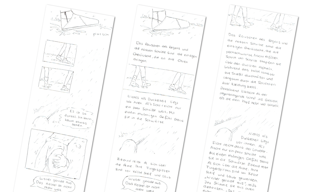
After clarification of the most important questions I began to scribble the first wireframes, only to realise that there was one thing left to be answered: How much visual aid is wished within the story?

So I decided to sketch 3 different beginnings, increasing the visuals or the text. I assembled a group of eight people fitting the personas to vote for their favourite and asked for the reason behind each choice. Five of eight preferred the version where the text is predominant, because they had a longer lasting reading experience and the passages allowed for beautiful descriptions to set the atmosphere in text form as well. Therefore, I continued with the more textual draft.
Design: Visualising and testing
Style guide and mood
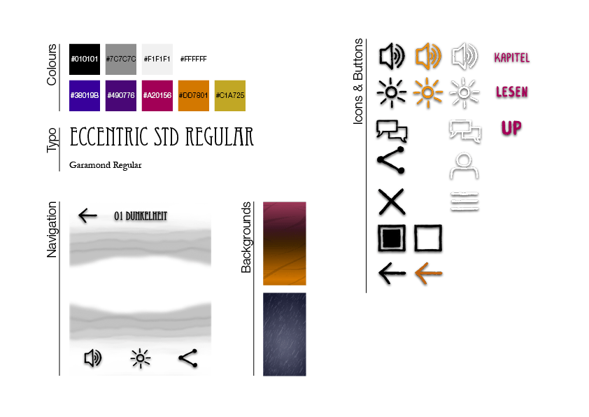
Since I wanted a high-fidelity prototype for testing, my next step was to define colours, typography, and style. I chose a dark background and colours to emphasise the mood and circumstances of the opening scene. The drawn look of the icons and the serif font for the main text were selected to resemble paper books. The menu and settings use a foggy optic to create a mystical feeling and to complement the story as fog plays a major role. I implemented the prototype with Adobe XD adding a 3D effect while swiping, changing backgrounds, side information and the possibility to vote at the end of the chapter.
.
Usability Testing
Then it was finally time for some tests. I choose to go with a pluralistic walkthrough to check the usability and an interview for general feedback on the reading experience. For this I tested 6 people which fit the personas. They had to identify the icons, vote at the end, find the settings, the menu, and of course read the story.
Two of them didn’t know that a tap on the middle of the screen opened the reading settings, but they found it through experimentation. While this interaction is still ensuring the whole screen for reading, it may be a good idea to keep the settings visible when first opening the story and letting them vanish with the first scrolling. Most of the participants didn’t like to swipe for reading either and prefer scrolling.
The question at the end of the story with the possibility of voting created positive feedback as well as the general design. All participants preferred reading with backgrounds and pictures, because “it creates more atmosphere and deeper emotions”.

Code: Building the front end
Technical possibilities
Before starting to translate everything into a web app, I checked all options and practices to create a minimal viable product (MVP). I decided to go with a front end based on HTML, CSS and JavaScript, while trying to keep the latter at a minimum to reduce loading times. This is also why I decided against a library at the beginning of implementation.
Limiting the workload further I focused on the mobile view and the chrome browser, because the majority, around 50%, of Germans use chrome as their mobile browser.
Animations and graphics
While researching for the best approach I stumbled over the question: “What kind of format is the best for the content animations and graphics?” In literature, different practical solutions and opinions exist, all of which have advantages and disadvantages. Thus I decided to create different versions and compare their performance:
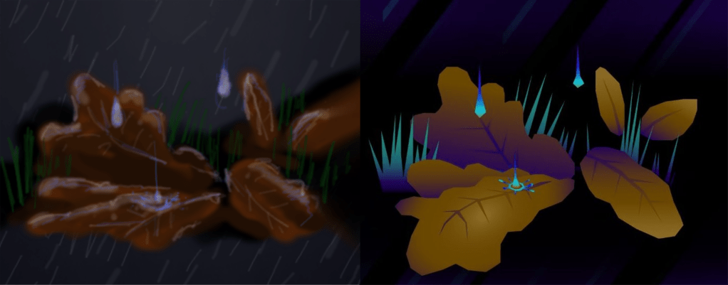
- Pixel-based graphics and animations with the .webp or .webm format.
- Vector-based graphics with SVG and CSS3 animations.
To make it comparatively fair, I had to redesign the graphics and animations to be as similar as possible. I used adobe illustrator to create the graphics, adobe after effects for the pixel-based animations and coded the CSS3 animations inside the SVG data.
Optimising experience
My tool of choice for comparing the performance was Google Lighthouse with its user centred metrics. I used them, because these metrics were specifically put together to ensure a great user experience and therefore a great reading experience.
While checking the CSS3 animations I soon ran into a problem: With the animation code inside of the SVG file, all animations kept getting calculated in the main thread and would slow down any other interaction with the website. So I created a third prototype in which I used JavaScript to activate and deactivate the animations. Theoretically, this should have optimized the metrics, but since I wasn’t sure how much the JavaScript would slow the application down, I decided to also test those two prototypes against each other.
Tests and results
To ensure the results all 3 prototypes were tested on 5 different devices and at least 40 times to create stabile means. I checked for significant differences with a Student’s t-test between the pixel-based and vector-based version and later the two different versions of the vector-based approach.

The results showed that the vector-based prototype outperformed the pixel-based version in nearly every metric.
The second test did not have such clear results. The version without the additional JavaScript performed better in most metrics except the calculated layout shift. But in the overall score the prototype with the additional JavaScript showed a competitive score – especially on the newer smartphones. This may be because smartphone builders continue to optimize their devices and mobile browsers become better at handling JavaScript.
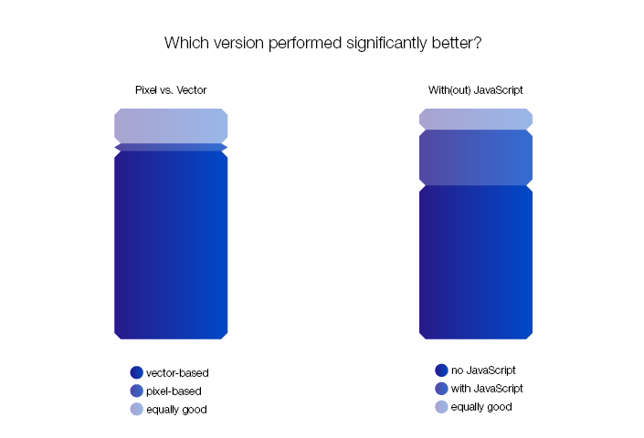
My recommendation after this test is to use vector-based graphics if possible as they have better metrics and do not need different resolutions depending on the size of the mobile device. The usage of JavaScript with mobile web applications should be kept as low as possible, but considering the advancing technology this needs to be tested depending on the users’ devices and surroundings.
Coming to a conclusion
I started in this project with the idea of enhancing the reading experience of mobile e-books. Interviews, usability testing, and measuring metrics with different stages of prototypes helped a great deal to shape this idea into its current state.
From here on, there are different ways to continue. One would be to extend the front end and test it in other browsers, another to fit it for desktop screens. It is also possible to publish what’s already there, collect feedback and introduce new features when they are successfully implemented.
In the end, I have gained valuable insight with this project. Not only have I confirmed that subtle visuals and backgrounds create more emotions while reading, or that vector-based and clean graphics perform better on mobile browsers. I also learned that I enjoyed working in a team more than alone, that it saves time and changes in concept to check all technical possibilities in the beginning, and that more data always generates more accurate results.
